Thursday, May 14, 2020

EXP 2 Submission

The model was placed onto the 3D Warehouse. The model's name is "ARCH1101 EXP2 2020 Zahraa Kachwalla".


Five Lumion Rendered Images

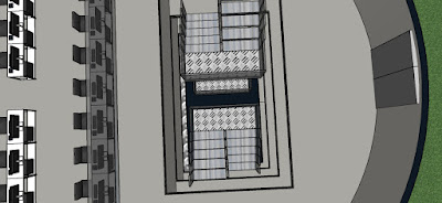
Image of the model itself. It consists of three main parts, the school, the bridge and added workshop and academic spaces. Blue is used as it enhances focus, improving study.

An opening in the top of the school allows for light to filter down the central cavity, in which the staircase is located. The staircase connects the main school by running through its center, as relating to my theory. 

View from an outdoor area, located on the second level of the main school.

When looking out from the academic offices, you can see the main school.

Window from one of the workshops, located on the lowest branch of the bridge, showing the diagonal elevator, the opposite branch of the bridge.

Monday, April 27, 2020

Week 11 - Peer Reviews

Peer Review #1


Peer Review #2

Week 10 - Moving Elements

Moving Element #1 : retractable studio wall extensions


Before extending walls

After extending walls


The walls can retract and extend depending on the needs of the user. This is possible for all four studios.


Moving Element #2 : diagonal elevator


The compartment starts at the bottom

Before sliding up and connecting to the bridge, at which point the people inside can exit

This elevator makes access to UNSW buildings, such as the squarehouse, easier.

Week 10 - Textures

Textures
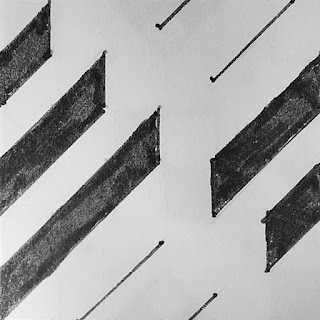
        =>  Words used: Linear, Rotational, Scalar, Opposing, Shift and Fluid <=


Note: all textures are within a 6x6 square, due to some of the designs having white area, they look as though they aren't. Also, the final shift design does fit into a 6x6 square, however when drawing it I accidentally went over. It should be cropped in line with the the texture next to it.

Application of Textures

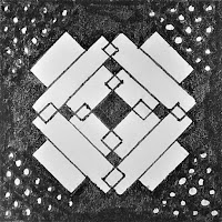
These three textures chosen as they contain shapes used frequently throughout the model. They also are similar, and as such work together, but also unique in their own way.

Texture #1:
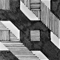
Image of texture sample
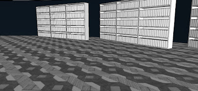
Located in the library - highlights separation between library and gallery and also shows intended path of movement


Texture #2:
Image of texture sample
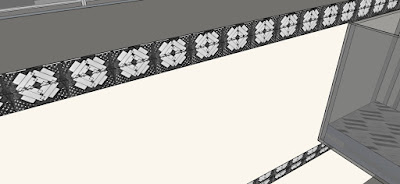
On the edge of central cavity - highlighting the progression of levels, signifying upward movement


Texture #3:
Image of texture sample

On platform of stairs - to highlight progression of stairs, upwards movement


Week 9 - Animated Drawings

Planning for the Axonometric Animation


Axonometric Animation


2 Point Perspective Animation


Week 8 - The School

Selected Plan - Carlo Scapa


Planning for School


Re-imagined Section


Version 1
Version 2


Images of School/Bridge


Monday, April 20, 2020

Week 6 - Article and Theory

Key words are:
Unites, connects, expands

Theory:
A large continuous structure spanning the height of a building, connecting both the interior and exterior, unites the interior spaces whilst also expanding it into the external environment.

Reference:
Levy, Natasha. “Steel and concrete steps cut through facade of Stairway House by Nendo.” Dezeen. Published April 3, 2020. https://www.dezeen.com/2020/04/03/stairway-house-interiors-tokyo-architecture-nendo/